Review the Model Interface
In this exercise you’ll switch to Report view, and review the model interface.
Review the model interface
In this task you’ll switch to Report view, and review the model interface.
-
Switch to Report view.
-
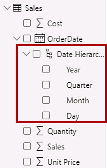
In the Data pane, notice the following:
- Columns, hierarchies and their levels are fields, which can be used to configure report visuals
- Only fields relevant to report authoring are visible
- The SalespersonRegion table isn’t visible—because all of its fields are hidden
- Spatial fields in the Region and Reseller table are adorned with a spatial icon
- Fields adorned with the sigma symbol (Ʃ) will summarize, by default
- A tooltip appears when hovering the cursor over the Sales | Cost field
-
Expand the Sales | OrderDate field, and then notice that it reveals a date hierarchy.
The Targets | TargetMonth field delivers a similar hierarchy. These hierarchies weren’t created by you. They were created automatically. There’s a problem, however. The Adventure Works financial year commences on July 1 of each year. But, in these automatically created date hierarchies, the date hierarchy year commences on January 1 of each year.
You’ll now turn off this automatic behavior. In the Create DAX Calculations in Power BI Desktop lab, you’ll use DAX to create a date table, and configure it define the Adventure Works’ calendar.
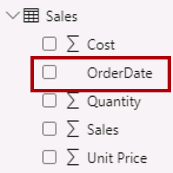
- To turn off auto/date time, Navigate to File > Options and Settings > Options > Current File group, and select Data Load.
- In the Time Intelligence section, uncheck Auto Date/Time.

-
In the Data pane, notice that the date hierarchies are no longer available.
Create Quick Measures
In this exercise, you’ll create two quick measures.
Create quick measures
In this task, you’ll create two quick measures to calculate profit and profit margin.
A quick measure creates the calculation formula for you. They’re easy and fast to create for simple and common calculations. You’ll create measures without using this tool in the Create DAX Calculations in Power BI Desktop lab.
-
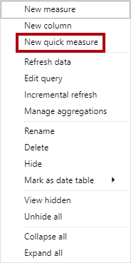
In the Data pane, right-click the Sales table, and then select New Quick Measure.
-
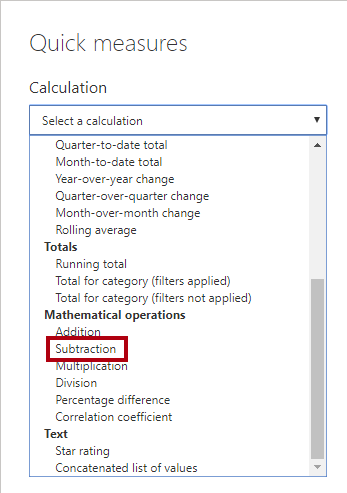
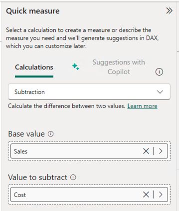
In the Quick Measures window, in the Calculation dropdown list, from inside the Mathematical Operations group, select Subtraction.
-
In the Data pane of the Quick Measures window, expand the Sales table.
-
Drag the Sales field into the Base Value box.
-
Drag the Cost field into the Value to Subtract box.
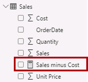
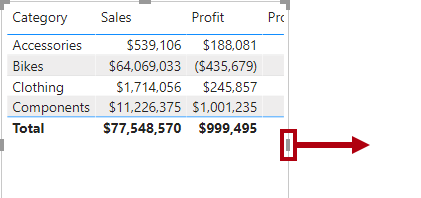
- In the Data pane, inside the Sales table, notice that new measure.
- Measures use the calculator icon.
-
To rename the measure, right-click it, select Rename, then rename to Profit.
Tip: To rename a field, you can also double-click it, or select it and press F2.
-
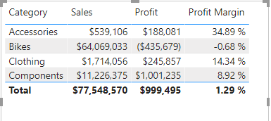
In the Sales table, add a second quick measure, based on the following requirements:
- Use the Division mathematical operation
- Set the Numerator to the Sales | Profit field
- Set the Denominator to Sales | Sales field
- Rename the measure as Profit Margin
-
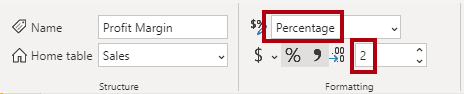
Ensure the Profit Margin measure is selected, and then on the Measure Tools contextual ribbon, set the format to Percentage, with two decimal places.
-
To test the two measures, first select the table visual on the report page.
-
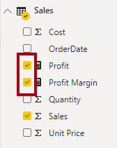
In the Data pane, check the two measures.
-
Select and drag the right guide to widen the table visual.
-
Verify that the measures produce reasonable results that are correctly formatted.
Create a many-to-many relationship
In this task, you’ll create a many-to-many relationship between the Salesperson table and the Sales table.
The labs use a shorthand notation to reference a field. It will look like this: Salesperson | Salesperson . In this example, Salesperson is the table name and Salesperson is the field name.
-
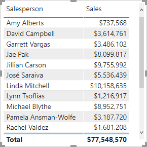
In Power BI Desktop, in Report view, in the Data pane, check the follow two fields to create a table visual.
- Salesperson | Salesperson
- Sales | Sales
The table displays sales made by each salesperson. However, there’s another relationship between salespeople and sales. Some salespeople belong to one, two, or possibly more sales regions. In addition, sales regions can have multiple salespeople assigned to them.
From a performance management perspective, a salesperson’s sales (based on their assigned territories) need to be analyzed and compared with sales targets. You’ll create relationships to support this analysis in the next exercise.
-
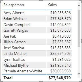
Notice that Michael Blythe has sold almost $9 million.
-
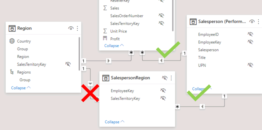
Switch to Model view, then drag the SalespersonRegion table to position it between the Region and Salesperson tables.
-
Use the drag-and-drop technique to create the following two model relationships:
- Salesperson | EmployeeKey to SalespersonRegion | EmployeeKey
- Region | SalesTerritoryKey to SalespersonRegion | SalesTerritoryKey
The SalespersonRegion table can be considered to be a bridging table.
-
Switch to Report view, and then notice that the visual hasn’t updated—the sales result for Michael Blythe hasn’t changed.
-
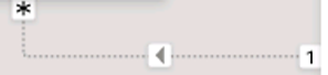
Switch back to Model view, and then follow the relationship filter directions (arrowhead) from the Salesperson table.
Consider that the Salesperson table filters the Sales table. It also filters the SalespersonRegion table, but it doesn’t continue by propagating filters to the Region table (the arrowhead is pointing the wrong direction).
-
To edit the relationship between the Region and SalespersonRegion tables, double-click the relationship.
-
In the Edit Relationship window, in the Cross Filter Direction dropdown list, select Both.
-
Check the Apply Security Filter in Both Directions checkbox, then select OK.
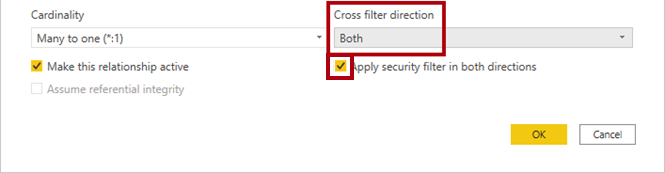
-
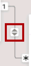
Notice that the relationship has a double arrowhead now.
-
Switch to Report view, and then notice that the sales values have still not changed.
The issue now relates to the fact that there are two possible filter propagation paths between the Salesperson and Sales tables. This ambiguity is internally resolved, based on a “least number of tables” assessment. To be clear, you shouldn’t design models with this type of ambiguity—the issue will be addressed in part later in this lab, and by the completion of the Create DAX Calculations in Power BI Desktop lab.
-
Switch to Model view to force filter propagation via the bridging table. Edit (double-click) the relationship between the Salesperson and Sales tables.
-
In the Edit Relationship window, uncheck the Make This Relationship Active checkbox, and select OK.
The filter propagation will now follow the only active path.
-
In the diagram, notice that the inactive relationship is represented by a dashed line.
-
Switch to Report view, and then notice that the sales for Michael Blythe are now nearly $22 million.
-
Notice also, that the sales for each salesperson—if added—would exceed the table total.
It’s a common observation of a many-to-many relationship due to the double, triple, etc. counting of regional sales results. Consider Brian Welcker, the second salesperson listed. His sales amount equals the total sales amount. It’s the correct result due to the fact the he’s the Director of Sales; his sales are measured by the sales of all regions.
While the many-to-many relationship is now working, it’s now not possible to analyze sales made by a salesperson (because the relationship is inactive). You’ll be able to reactivate the relationship when you introduce a calculated table that will allow analyzing sales made in the sales region(s) assigned to the salesperson (for performance analysis) in the Create DAX Calculations in Power BI Desktop lab.
-
Switch to Modeling view, and then in the diagram, select the Salesperson table.
-
In the Properties pane, in the Name box, replace the text with Salesperson (Performance).
The renamed table now reflects its purpose: it’s used to report and analyze the performance of salespeople based on the sales of their assigned sales regions.
Relate the Targets table
In this task, you’ll create a relationship to the Targets table
-
Create a relationship from the Salesperson (Performance) | EmployeeID column and the Targets | EmployeeID column.
-
In Report view, add the Targets | Target field to the table visual.
-
Resize the table visual so all columns are visible.
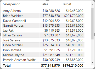
It’s now possible to visualize sales and targets—but take care for two reasons. First, there’s no filter on a time period, and so targets also include future target amounts. Second, targets aren’t additive, and so the total shouldn’t be displayed. They can either be disabled by formatting the visual or removed by using calculation logic. You’ll follow the second approach by creating a target measure in the Create Advanced DAX Calculations in Power BI Desktop lab that will return BLANK when more than one salesperson is filtered.
Finish up
In this task, you’ll complete the lab.
Save the Power BI Desktop file, and select Apply Later if prompted to apply queries.