Relationships, properties and hiearchies
Lab story
In this lab, you’ll commence developing the data model. It will involve creating relationships between tables, and then configuring table and column properties to improve the friendliness and usability of the data model. You’ll also create hierarchies and create quick measures.
In this lab you learn how to:
- Create model relationships
- Configure table and column properties
- Create hierarchies
This lab should take approximately 45 minutes.
Create model relationships
In this task, you’ll create model relationships. The file was configured to not identify relationships between tables in the previous labs. This isn’t the default setting, but is recommended to prevent extra work creating the correct relationships for your model.
Important: The labs use a shorthand notation to reference a field. It will look like this: Product | Category. In this example, Product is the table name and Category is the field name.
-
In Power BI Desktop, at the left, select the Model view icon.
-
If you don’t see all seven tables, scroll horizontally to the right, and then drag and arrange the tables more closely together so they can all be seen at the same time.
Tip: You can also use the zoom control located at the bottom of the window.
-
To return to Report view, at the left, select the Report view icon.

-
To view all table fields, in the Data pane, right-click an empty area, and then select Expand All.
-
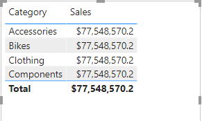
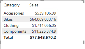
To create a table visual, in the Data pane, from inside the Product table, check the Category field.
-
To add another column to the table, in the Data pane, check the Sales | Sales field.
-
Notice that the table visual lists four product categories, and that the sales value is the same for each, and the same for the total.
The issue is that the table is based on fields from different tables. The expectation is that each product category displays the sales for that category. However, because there isn’t a model relationship between these tables, the Sales table isn’t filtered. You’ll now add a relationship to propagate filters between the tables.
-
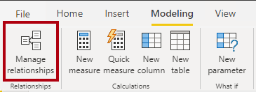
On the Modeling ribbon tab, from inside the Relationships group, select Manage Relationships.
-
In the Manage Relationships window, notice that no relationships are yet defined.
-
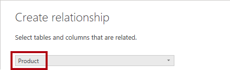
To create a relationship, select New Relationship.
-
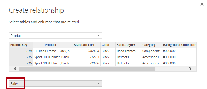
In the Create Relationship window, in the first dropdown list, select the Product table.
-
In the second dropdown list (beneath the Product table grid), select the Sales table.
-
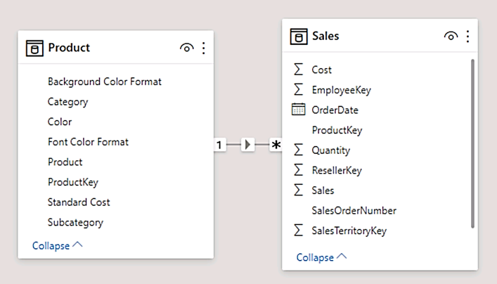
Notice the ProductKey columns in each table have been automatically selected.
The columns were selected because they share the same name and data type. You may need to find matching columns with different names in real data.
-
In the Cardinality dropdown list, notice that One To Many (1:*) is selected.
The cardinality was automatically detected, because Power BI understands that the ProductKey column from the Product table contains unique values. One-to-many relationships are the most common cardinality, and all relationship you create in this lab will be this type.
-
In the Cross Filter Direction dropdown list, notice that Single is selected.
Single filter direction means that filters propagate from the “one side” to the “many side”. In this case, it means filters applied to the Product table will propagate to the Sales table, but not in the opposite direction.
-
Notice that the Mark This Relationship Active is checked.
Active relationships propagate filters. It’s possible to mark a relationship as inactive so filters don’t propagate. Inactive relationships can exist when there are multiple relationship paths between tables. In this case, model calculations can use special functions to activate them.
-
Select OK, notice in the Manage Relationships window that the new relationship is listed, and then select Close.
- Notice that in Model View, there’s now a connector between the two tables (it doesn’t matter if the tables are positioned next to each other).
- You can interpret the cardinality that is represented by the 1 and (*) indicators.
- Filter direction is represented by the arrow head.
- A solid line represents an active relationship; a dashed line represents an inactive relationship.
- Hover the cursor over the relationship to highlight the related columns.
There’s an easier way to create a relationship. In the model diagram, you can drag and drop columns to create a new relationship.
-
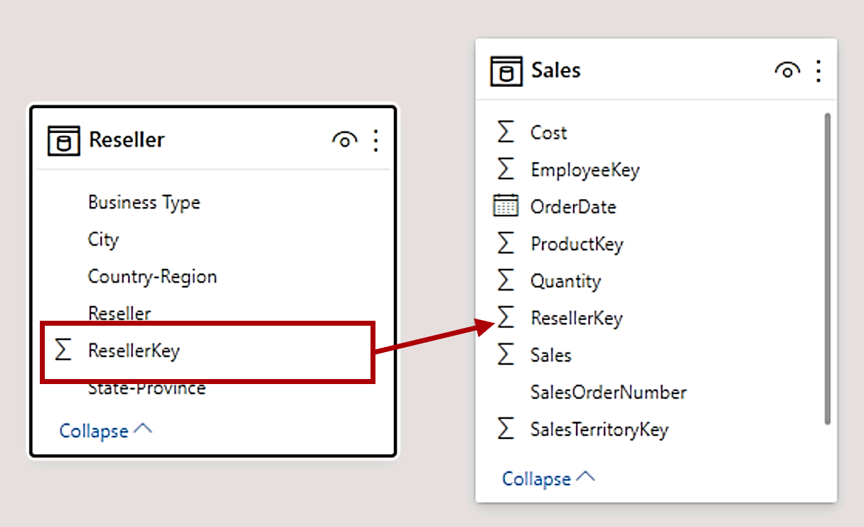
To create a new relationship using a different technique, from the Reseller table, drag the ResellerKey column onto the ResellerKey column of the Sales table.
Tip: Sometime a column doesn’t want to be dragged. If this situation arises, select a different column, and then select the column you intend to drag again, and then try again. Ensure that you see the new relationship added to the diagram.
-
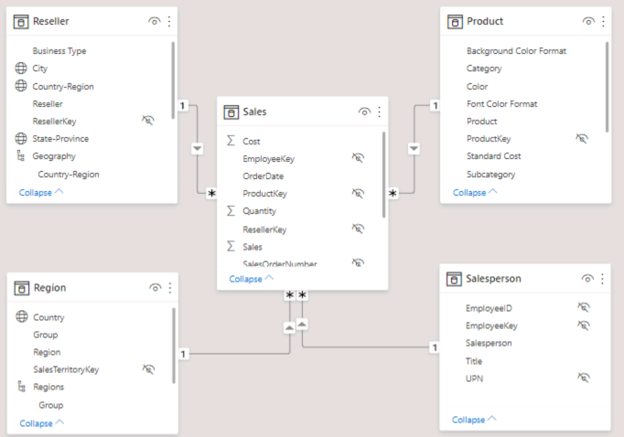
Use the new technique to create the following two model relationships:
- Region | SalesTerritoryKey to Sales | SalesTerritoryKey
- Salesperson | EmployeeKey to Sales | EmployeeKey
-
In the diagram, arrange the tables so that the Sales table is positioned in the center of the diagram, and the related tables are arranged about it. Position the disconnected tables to the side.
-
In the report view, notice that the table visual updated to display different values for each product category.
Filters applied to the Product table now propagate to the Sales table.
- Save the Power BI Desktop file.
Configure Tables
In this exercise you’ll configure each table by creating hierarchies, and hiding, formatting, and categorizing columns.
Configure the Product table
In this task, you’ll configure the Product table.
-
In Model view, in the Data pane, if necessary, expand the Product table to reveal all fields.
-
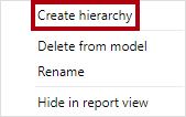
To create a hierarchy, in the Data pane, right-click the Category column, and then select Create Hierarchy.
-
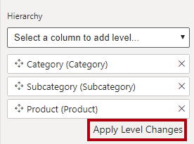
In the Properties pane (to the left of the Data pane), in the Name box, replace the text with Products.
-
To add the second level to the hierarchy, in the Properties pane, in the Hierarchy dropdown list, select Subcategory (you might need to scroll down inside the pane).
-
To add the third level to the hierarchy, in the Hierarchy dropdown list, select Product.
-
To complete the hierarchy design, select Apply Level Changes.
-
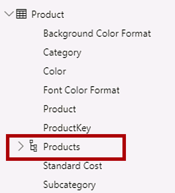
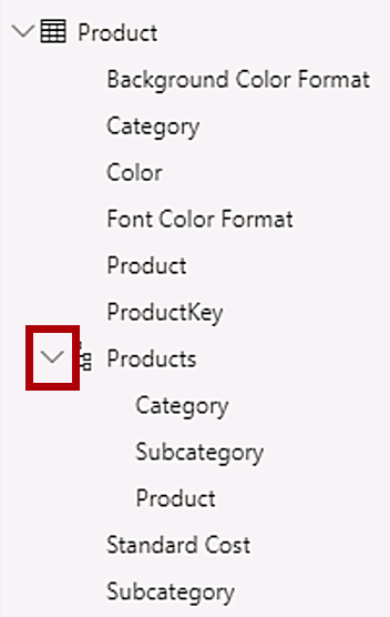
In the Data pane, notice the Products hierarchy.
-
To reveal the hierarchy levels, expand the Products hierarchy.
-
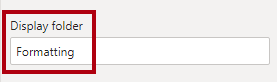
To organize columns into a display folder, in the Data pane, first select the Background Color Format column.
-
While pressing the Ctrl key, select the Font Color Format column.
-
In the Properties pane, in the Display Folder box, enter Formatting.
-
In the Data pane, notice that the two columns are now inside a folder.
Display folders are a great way to declutter tables—especially for tables that comprise many fields. They’re logical presentation only.
Configure the Region table
In this task, you’ll configure the Region table.
-
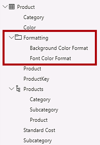
In the Region table, create a hierarchy named Regions, with the following three levels:
- Group
- Country
- Region
-
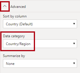
Select the Country column (not the Country hierarchy level).
-
In the Properties pane, expand the Advanced section (at the bottom of the pane), and then in the Data Category dropdown list, select Country/Region.
Data categorization can provide hints to the report designer. In this case, categorizing the column as country or region provides more accurate information to Power BI when it renders a map visualization.
Configure the Reseller table
In this task, you’ll configure the Reseller table.
-
In the Reseller table, create a hierarchy named Resellers, with the following two levels:
- Business Type
- Reseller
-
Create a second hierarchy named Geography, with the following four levels:
- Country-Region
- State-Province
- City
- Reseller
-
Set the Data Category for the Country-Region, State-Province, and City columns (not the hierarchy level) to Country/Region, State or Province, and City, respectively.
Configure the Sales table
In this task, you’ll configure the Sales table.
-
In the Sales table, select the Cost column.
-
In the Properties pane, in the Description box, enter: Based on standard cost.
Descriptions can be applied to tables, columns, hierarchies, or measures. In the Data pane, description text is revealed in a tooltip when a report author hovers their cursor over the field.
-
Select the Quantity column.
-
In the Properties pane, from inside the Formatting section, slide the Thousands Separator property to Yes.
-
Select the Unit Price column.
-
In the Properties pane, from inside the Formatting section, set the Decimal Places property to 2.
-
In the Advanced group (you may need to scroll down to locate it), in the Summarize By dropdown list, select Average.
By default, numeric columns will summarize by summing values together. This default behavior isn’t suitable for a column like Unit Price, which represents a rate. Setting the default summarization to average will produce a meaningful result.
Bulk update properties
In this task, you’ll update multiple columns using single bulk updates. You’ll use this approach to hide columns, and format column values.
-
In the Data pane, select the Product | ProductKey column.
-
While pressing the Ctrl key, select the following 13 columns (spanning multiple tables):
- Region | SalesTerritoryKey
- Reseller | ResellerKey
- Sales | EmployeeKey
- Sales | ProductKey
- Sales | ResellerKey
- Sales | SalesOrderNumber
- Sales | SalesTerritoryKey
- Salesperson | EmployeeID
- Salesperson | EmployeeKey
- Salesperson | UPN
- SalespersonRegion | EmployeeKey
- SalespersonRegion | SalesTerritoryKey
- Targets | EmployeeID
-
In the Properties pane, slide the Is Hidden property to Yes.
The columns were hidden because they’re either used by relationships or will be used in row-level security configuration or calculation logic.
-
Multi-select the following three columns:
- Product | Standard Cost
- Sales | Cost
- Sales | Sales
-
In the Properties pane, from inside the Formatting section, set the Decimal Places property to 0 (zero).
Finish up
In this task, you’ll complete the lab.
Save the Power BI Desktop file, and select Apply Later if prompted to apply queries.